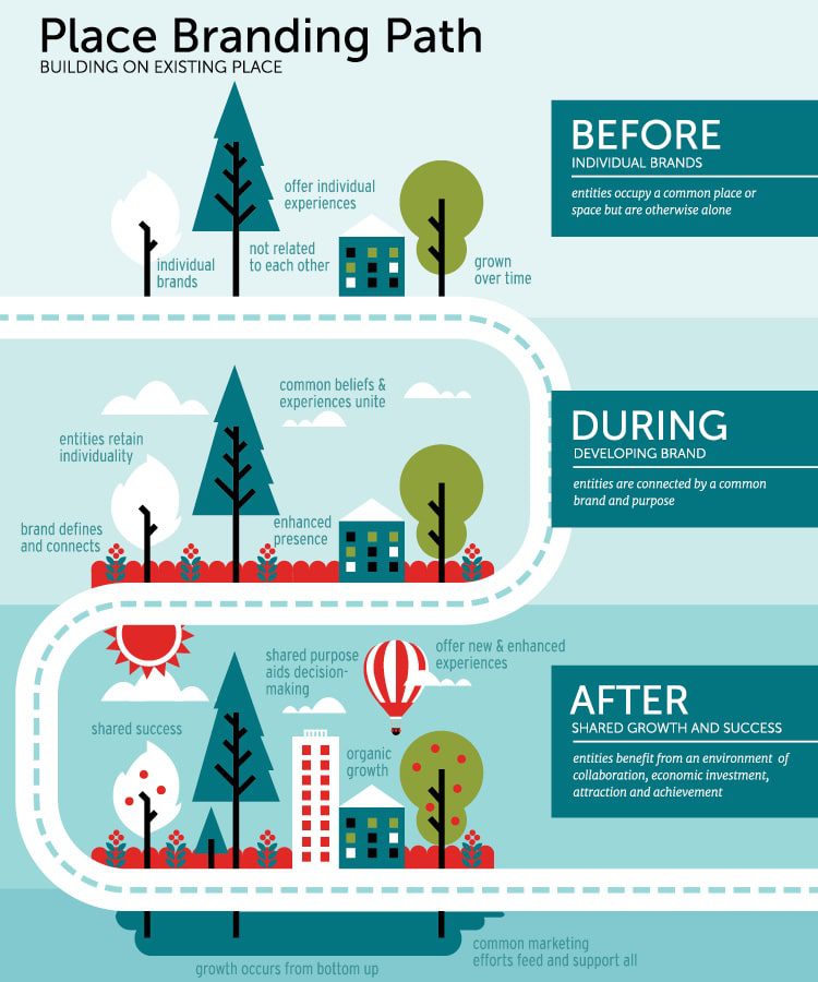
“The dynamic brand approach invites residents, artists, and entrepreneurs to shape the story together — turning them from audiences into storytellers.”
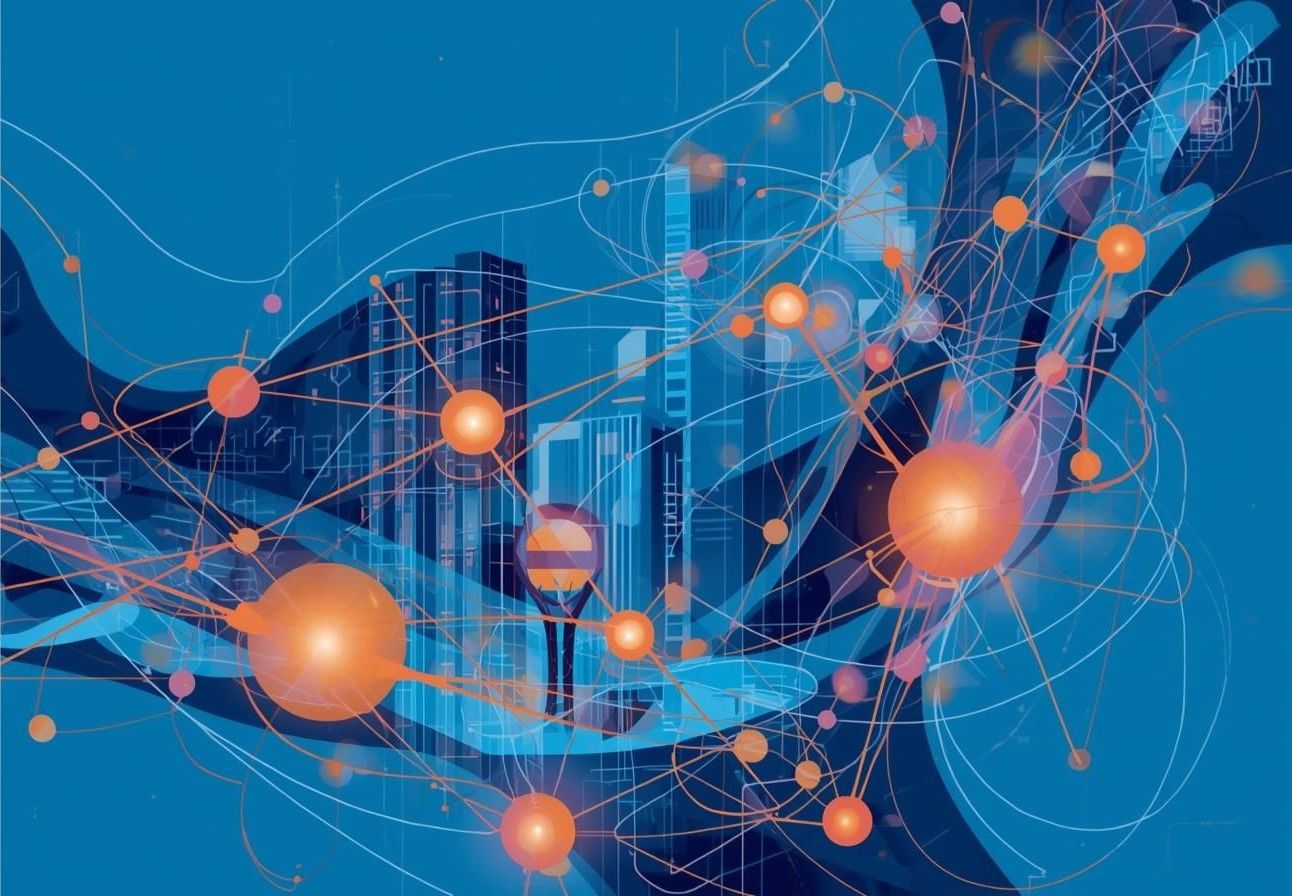
“City branding today requires an adaptive identity that reflects constant social and cultural evolution. A city’s identity must move, adapt, and stay emotionally connected to its citizens.”
𝐁𝐫𝐚𝐧𝐝 𝐈𝐝𝐞𝐧𝐭𝐢𝐭𝐲 𝐢𝐧 𝐌𝐨𝐭𝐢𝐨𝐧: 𝐓𝐡𝐞 𝐃𝐲𝐧𝐚𝐦𝐢𝐜 𝐀𝐩𝐩𝐫𝐨𝐚𝐜𝐡 𝐭𝐨 𝐂𝐢𝐭𝐲 𝐁𝐫𝐚𝐧𝐝𝐢𝐧𝐠
After years managing city brands, one truth has become clear: no city stands still — and neither should its brand. Urban identity is not a logo exercise or a tagline competition. It is a living, breathing expression of the people, rhythms, and stories that make a place unique.
Traditional branding focused on control and consistency. The dynamic brand approach focuses on relevance and co-creation. It invites residents, artists, and entrepreneurs to shape the story together — turning them from audiences into storytellers. As PRINT Magazine’s in-depth exploration of city branding makes clear, the most resonant urban identities emerge not from top-down mandates but from deep engagement with the people who actually live the city every day.
From Control to Co-Creation
For decades, the dominant model of city branding was borrowed from the corporate world: establish a visual system, enforce its use, and protect the mark. Discipline was the virtue. Any deviation was a threat.
That model worked well enough when cities competed primarily on tourism posters and civic signage. It buckles under the weight of social media, participatory culture, and an era when a single resident’s Instagram reel can do more for a city’s image than any official campaign.
The shift is not about surrendering control. It is about designing for participation. The most successful dynamic city brands create a framework – values, visual grammar, tone – flexible enough to absorb new voices without losing coherence.
Visual Identity as a Living System
Visual identity, too, becomes fluid in this model. A modular system — flexible colors, evolving patterns, adaptable symbols — reflects a city’s rhythm and diversity rather than freezing it in time. This adaptability does not weaken the brand; it makes it human.
Think of it as a design language rather than a design decree. The vocabulary stays consistent: certain shapes, proportional relationships, typographic sensibilities. But the sentences you can build with that vocabulary are infinite. A festival looks different from a transit campaign, which looks different from a tourism ad — yet all three are unmistakably the same city.
This approach has precedent in some of the world’s most admired place identities. As Transform Magazine’s analysis of placemaking and city brands demonstrates, cities like Singapore and London have built enduring brand equity not by locking down a single image, but by aligning their identity with the lived experience of public space — letting the city itself become the brand’s most powerful expression.
Emotional Resonance Over Repetition
Ultimately, a successful city brand is not built by repetition but by emotional resonance. Repetition builds recognition. Resonance builds belonging. The goal is not that people can identify your logo — it is that they feel the brand is theirs.
A city brand achieves this when people see themselves in it: when a young creative in the arts district feels the brand reflects her work, when a long-time resident sees his neighborhood’s history honoured, when a new arrival feels genuinely welcomed rather than marketed to. The brand becomes part of their pride, their creativity, their everyday life.
This is not a soft goal. It is a strategic one. Cities that generate genuine emotional attachment among residents produce more authentic advocacy, stronger cultural exports, and more durable reputations than any advertising budget can manufacture.